I believe that nowadays there’s a misconception on how much work is put into getting good work done.
My “Behind The Line” posts will be geared towards showing how much time and effort goes
into finishing my work and hopefully it will show that although its fun,
it isn’t easy to pull it off nor effortless. Also, if a fellow creatives learns something from how I do my projects that will also be a huge plus.
So when I was making my site, I knew I wanted a picture of myself. But I didn’t want to do a selfie.
That really isn’t my thing. And I couldn’t find a picture of myself that I like. Then it hit me.
Why not just tackle my first ever self portrait?
And I thought I could also use what I learned from Alphonso Dunn’s Book On Pen and Ink.
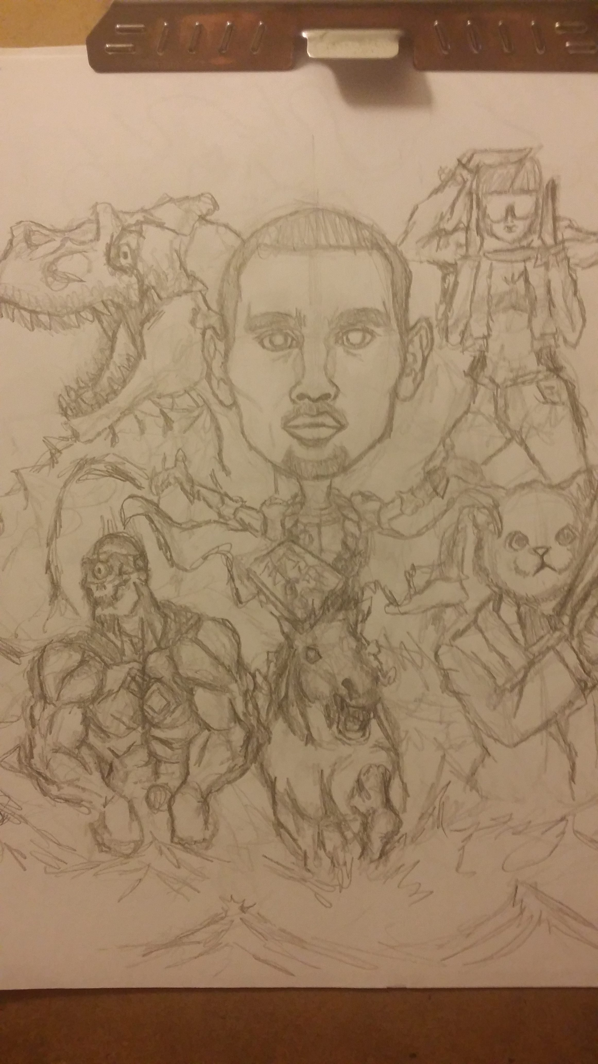
So here was my first attempt.

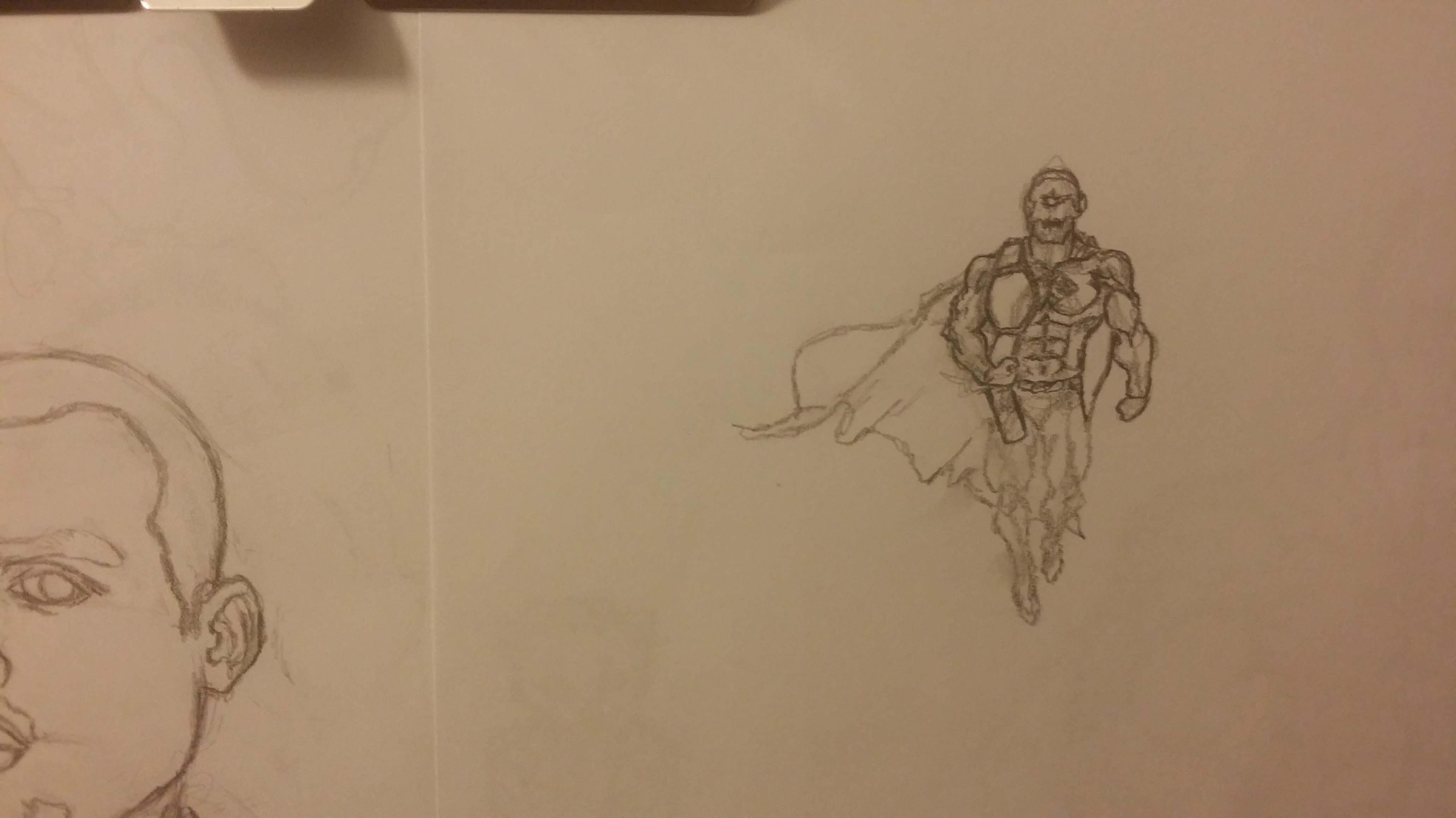
Notice the cape? I wouldn’t be surprised if you didn’t. You can’t really tell it apart from the creature.
It was pointed out to me from some fellow creatives.
However, there was one thing I learned I wanted to do.
Draw my head on a cartoon body with more monsters around.
So far the second iteration I was decently happy about it in the pencils.
Although I think it took me a couple of drafts.
So I went on and decided to begin inking the whole thing.
And then probably the most important part of it, I messed up.
My face didn’t look like me.
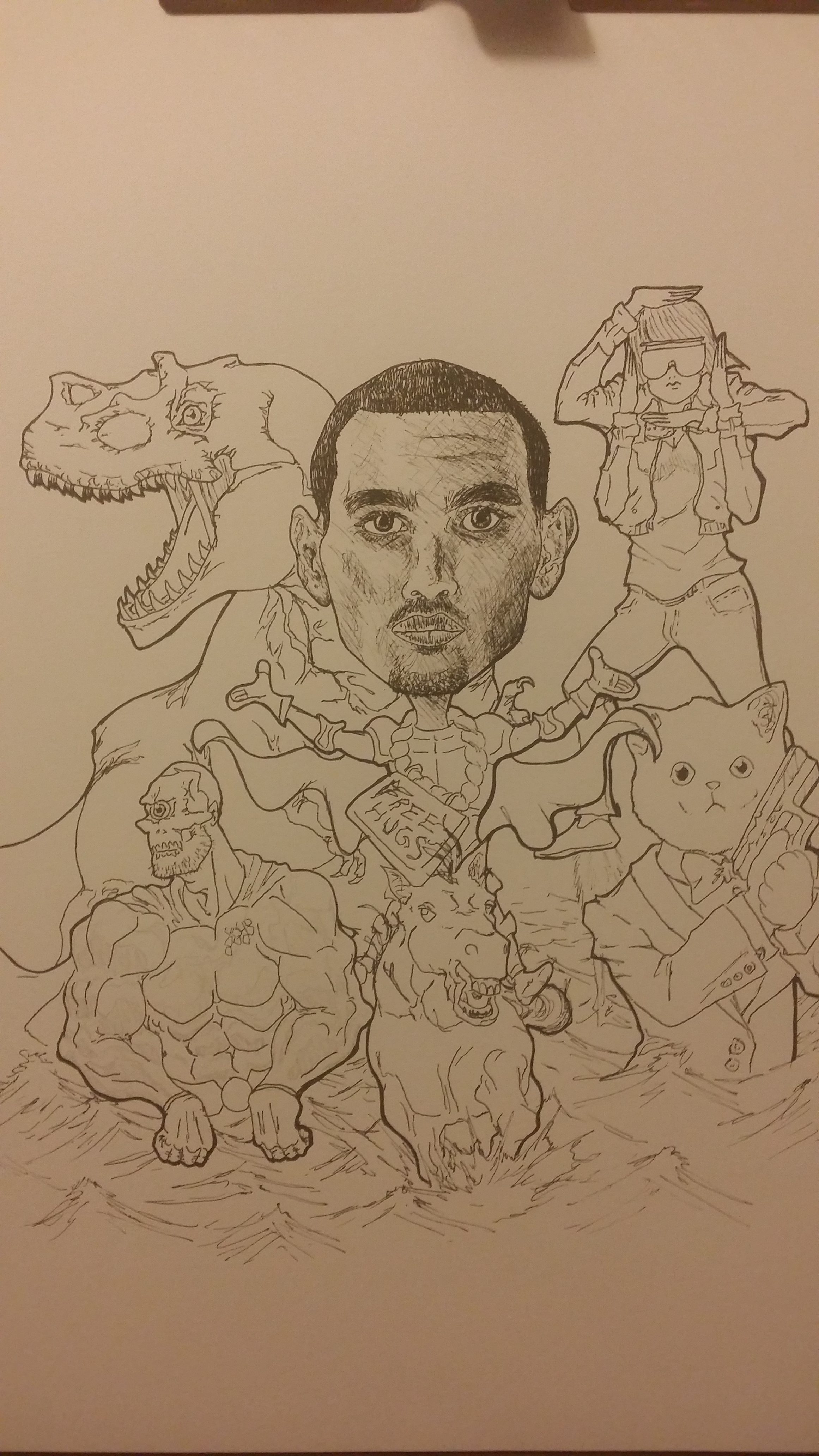
So I had to do it all over again. Le sigh.
This time however, I decided to make some huge changes.
It was easier to draw me from a quarter view than from a straight away.
And I wanted to change up how the monsters are.
I drew myself and the two characters at my sides on one page and then the cyclops and Dino
on separate papers to play around where in the background they would fit.

Sadly, there was stuff I had to cut.
I already had to cut the horse from it because of the change in my view.
But then I actually couldn’t work how the cyclops would fit.
He just didn’t seem to belong to this new set up so I ended cutting him too.
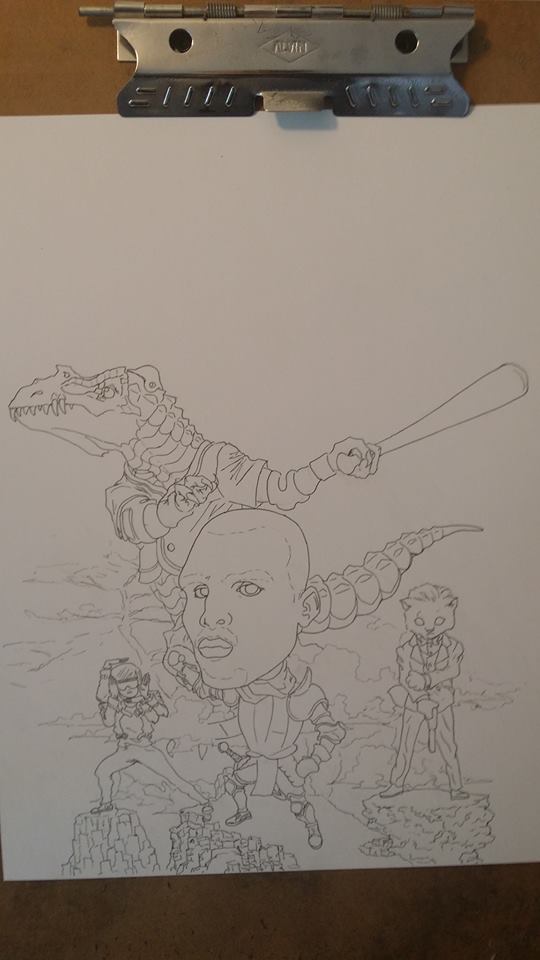
Overall I was really happy with the individual stuff but then I went and put it together.
My colleagues told me that the left side seems heavier on balance than to right side.
One of the major reasons is because my head needed to be put further back as it looked wrong anatomy wise.
I used various cliffs but I noticed my favorite was the one the kitten was standing on.
And I stopped liking how my body looked. So I had one more huge change for it.
An element that I earlier cut but will make a return.
Bam! Ma steed! I took it from Napoleon Taking the Alps painting.
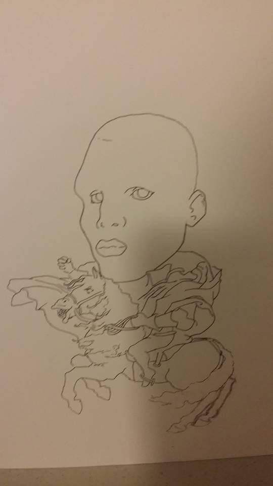
I also tried to see if I could work the Cyclops in but I still didn’t like it. So he got cut indefinitely.
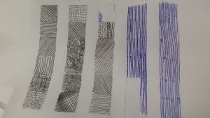
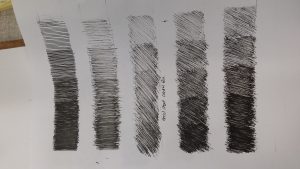
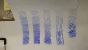
I moved on to shading the whole thing. While doing this I was going through Alphonso Dunn’s book on Ink with pen because I wanted to make my drawings feel more 3d. Take a look at these pictures. It is a small portion of the amount of practice I was putting in to get my hatching to a decent level at least.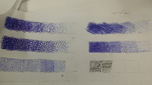


And here it is.
The Final Version.
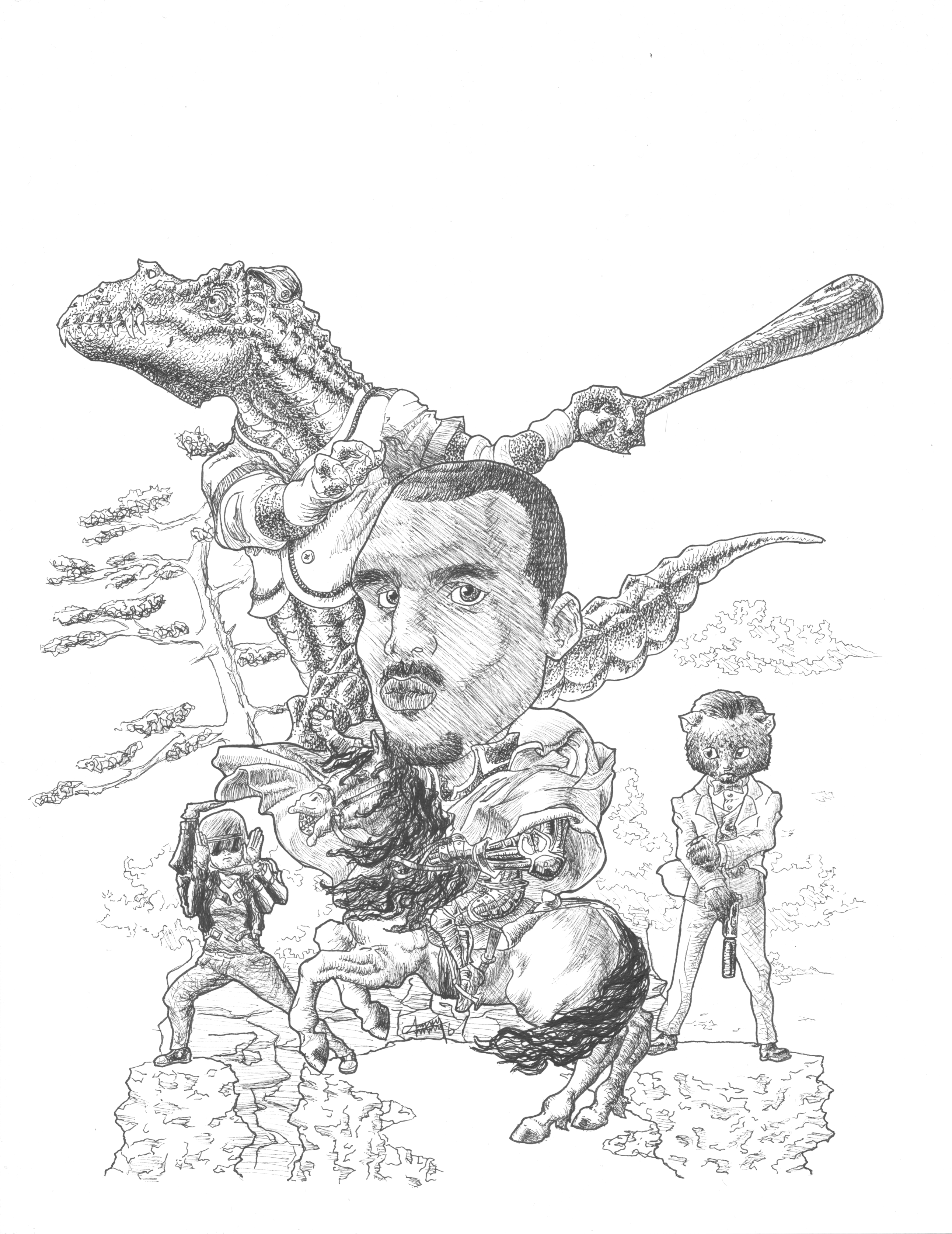
There’s some stuff that I wish I would’ve done better but overall I am happy with it. It took me a really long time. I didn’t time myself but it took me roughly six to eight hours to complete just the final version.
As for materials, I used Micron Pens.
Thanks for reading. If you liked it and you think others will too, don’t hesitate to share on your social media platform of choice on the bottom. Also, comment your thoughts too. Till next time!
Leave a Reply